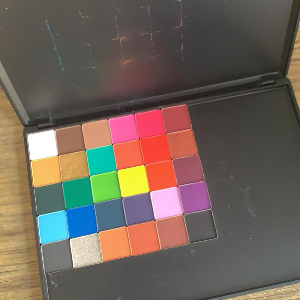
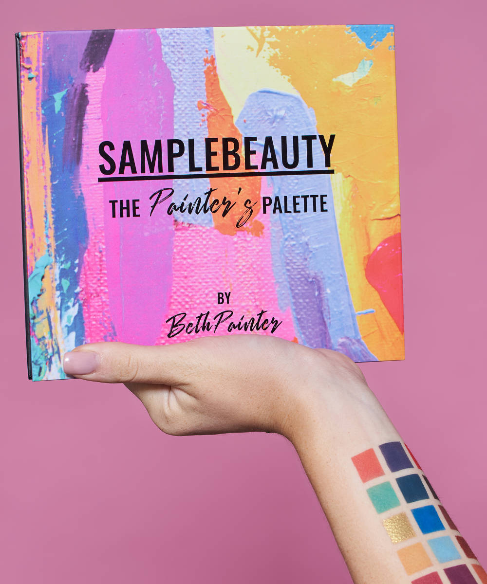
Every once in a while, a collab comes along that changes the whole makeup game, and ladies and gentlemen, it’s happened again. The palette that will define your summer/autumn looks is here thanks to MUA @bethpaintermakeup and Sample Beauty. The Painter’s Palette confirms what many of us already knew: makeup is art. Packed with 30 carefully crafted shades, the palette is here to help you find your inner artist and express your creativity.
We caught up with Beth and Clo Bell, founder of Sample Beauty, to give you the inside scoop behind their iconic collab.
What made you want to collab with Beth for this palette?
Clo: When I started the brand in Liverpool, I had a girl called Kelsey working with me and it was Kelsey’s idea to collab with a makeup artist. So I gave Kelsey the task of researching into different people and finding a really good person for the brand. We chose Beth without her knowing and we basically just watched her. We kept an eye on growth and the kind of looks she was doing to see if she would be a fit for the brand. We did that for two or three months before I was like ‘Yes, definitely want her, she’s the person for us.’
I emailed Beth and I was really honest about watching her work but that we really loved her work and she was a great fit. Within a week she was in the office and we just sat and designed the palette. We just smashed it out within a couple of hours!
What made you accept the offer, Beth?
Beth: I had never done anything like this before so when she messaged me, I was like *gasp* I was like this is the scariest thing ever because of the responsibility. When really, it’s not because it’s been so good! There has been a responsibility to get everything right, but it’s been so much fun.
Where did you find influence?
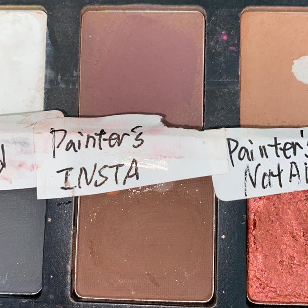
Beth: I took inspiration from Mitchell’s palette because I loved the lilac and I loved the cool brown. I was saying to Clo, I really need a cool brown to go in the crease. So I was definitely inspired by that. But really, I just found my own colourway and put it all together and it all just worked.
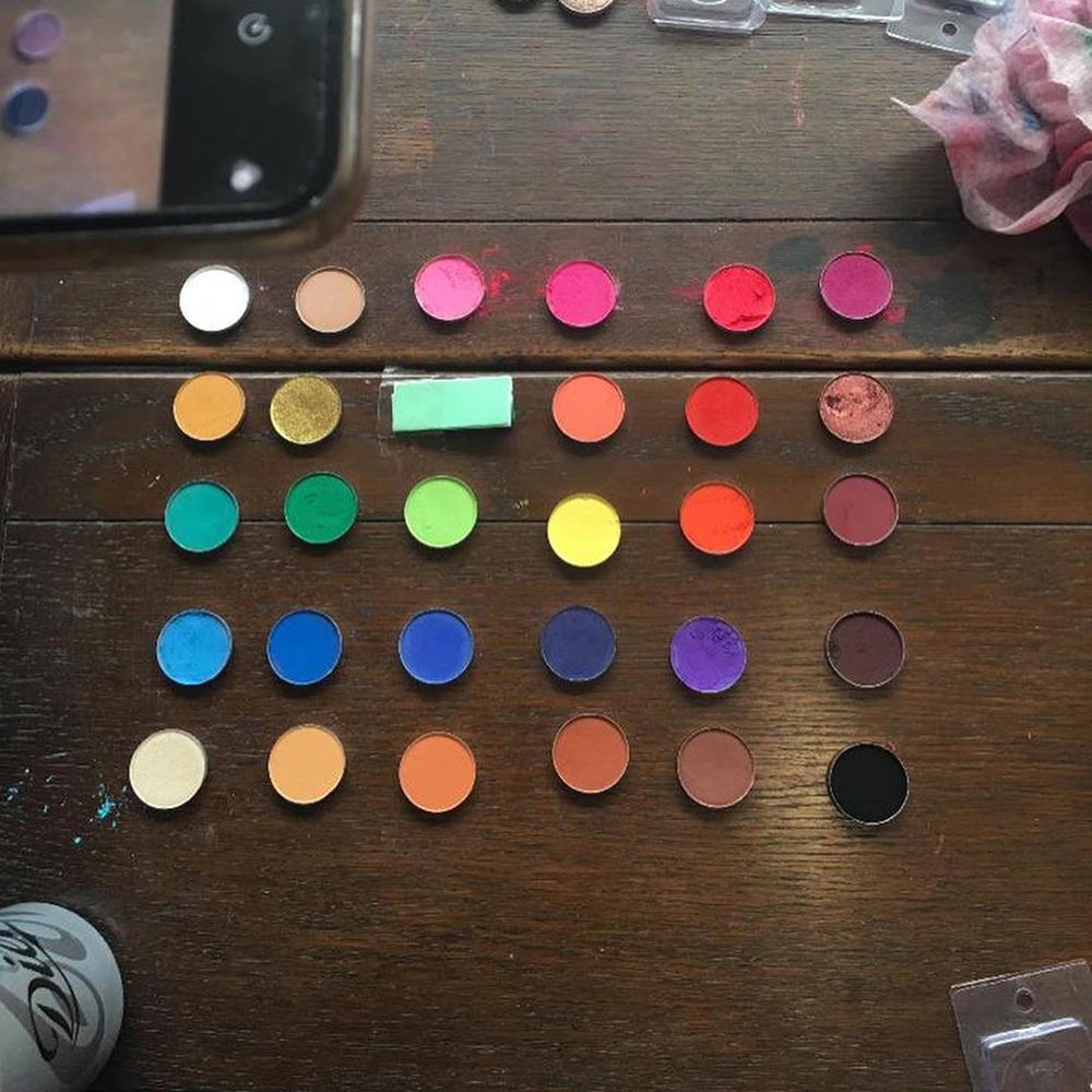
Clo: We basically lined every colour you can think of on a table so we could see the shades. We put them into colour groupings and then Beth just picked the colours she wanted. But it was 100% Beth. I advised throughout on what colours our customers want and what our demographic is. But we did it in all in a day.
How did you create the packaging design?
Beth: I said to Clo that I would love for the palette to look like a canvas with paint strokes because if we are going to do a Painter’s Palette we should just go all out and make it look like a canvas.
Clo: We knew it was going to be called The Painter’s Palette, we always knew that. We knew that was going to be the strategy and the campaign behind it so it all tied in. Inside is obviously super colourful and kind of a one stop shop kind of palette, we didn’t one people having to dip into another palette. So, once Beth sent me the idea for the outside, we found a piece of work that tied in all the shades in the palette to the outside. So the paint stokes that are on the outside are all the colours on the inside, so it just fitted perfectly.
Were there any major changes to the palette through the process?
Beth: We just knew straight away. As soon as we made the colours, we just knew there was nothing we wanted to change.
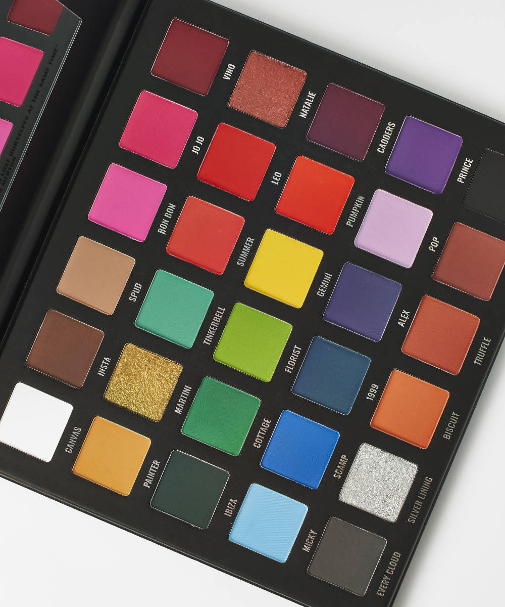
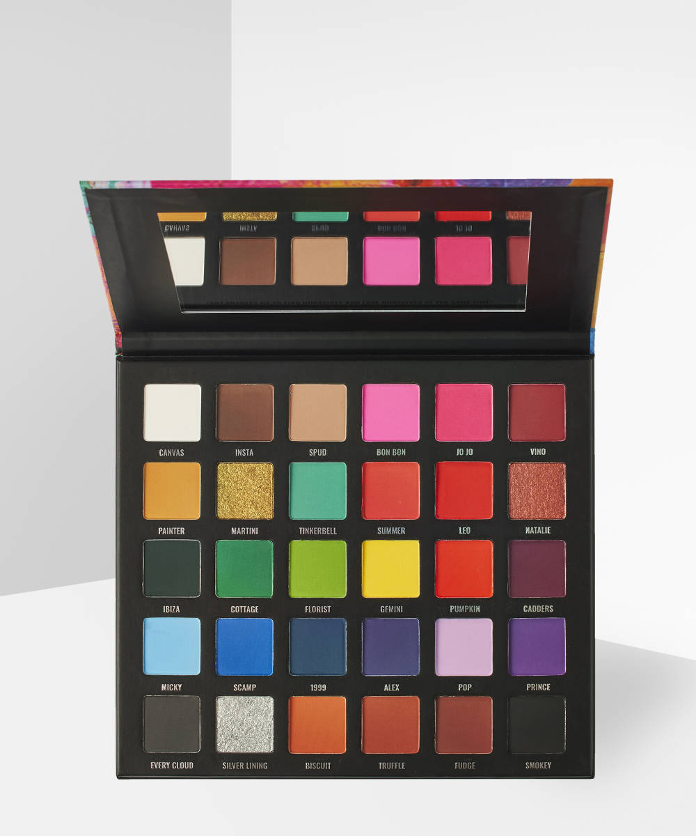
Clo: The very last change we made was to the grey. We put it next to the silver and it was Beth’s idea to call the grey Every Cloud and the silver Silver Lining. They’re next to each other in the palette and that was the last change we made, and we were like ‘This is it!’
Do you have a favourite shade?
Beth: Oh my god my favourite shade out of the whole palette is the really dark blue. I don’t know why!
Clo: It’s such an unusual colour. It’s like a navy but really unique. My favourite is definitely the grey, hands down! Because my eyes are like a green-grey, so the colour and the formula is amazing. It doesn’t blend out into different colours like other greys can.
Beth: I was like I needs to be neutral! It can’t be a cool grey, it needed to be flat grey. That was really important so that it didn’t turn blue on concealer. So we nailed it!
Do you have a tips for using the palette?
Beth: If you’re going to put it on a cool toned concealer, most of the colours are going to come out cooler because they are mixing with that cool base. I usually prefer to use a base that’s a little bit warmer for a warm undertone, so your colours come out truer.
I like to wet the shimmers too. They are already foiled but if you wet them on your brush with setting spray they will literally turn into melted gold.
Clo: Yes! When you swatch those shimmer shades, they’re like metal. They’re amazing.
Oh we nearly forgot to mention the message on the mirror! We wanted to make it a little more especial and give it a touch of artistry. Beth found the quote and we decided to print it on the mirror so every time you use it you can see the quote.
Beth: The quote is from Thomas Merton, an artist. It says: ‘Art is the only way to find yourself and lose yourself at the same time.’
I loved it because when you’re doing your makeup, you’re just focusing on your makeup, you’re not thinking about anything else and you can really relax doing it. It is a little bit of therapy. And you do find yourself. You find what you like and what suits you best and what makes you feel confident.
Clo: From a Sample Beauty brand perspective, that is one of our strong messages: you do whatever you want to do.
Are there any more plans for the future?
Clo: We have quite a few ideas already.
Beth: If everything goes well, then maybe!